
Creating a Custom Executive Cost View in VCF Operations #
Before building any meaningful dashboard in VCF Operations, it is critical to establish a structured data foundation. Dashboards are only as effective as the views that power them. Rather than relying on default widgets, this implementation begins by creating a reusable cost-focused List View that surfaces VM-level financial metrics in a structured and executive-ready format.
This custom view will:
• Display month-to-date spend
• Project monthly cost
• Show daily burn rate
• Surface effective daily CPU, memory, and storage usage
• Provide an aggregated summary total
All screenshots in this article have been sanitized to remove environment-specific identifiers. Hostnames, cluster names, domain paths, and organizational labels have been blurred or replaced with generic identifiers to protect operational data.
Step 1 — Navigate to Views #
From the VCF Operations interface:
Infrastructure Operations
→ Dashboards and Reports
→ Views
→ Create
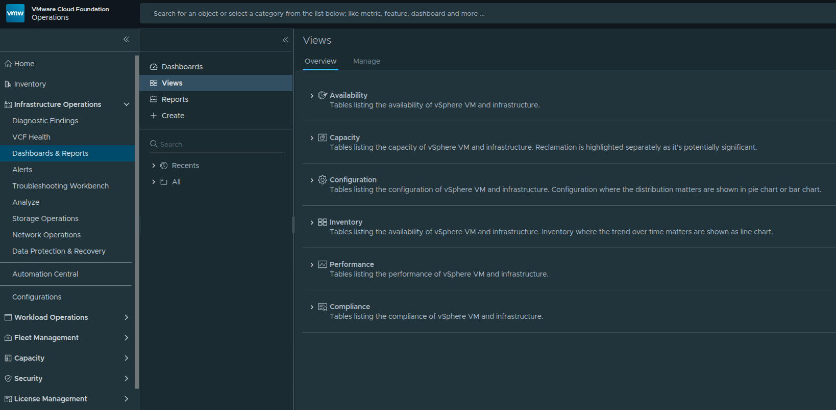
Navigating to the Views configuration area within VCF Operations.
Step 2 — Select the List View Type #
When prompted to select a view type, choose:
List
A List View allows cost metrics to be presented in a structured tabular format, making it ideal for executive reporting and dashboard integration.
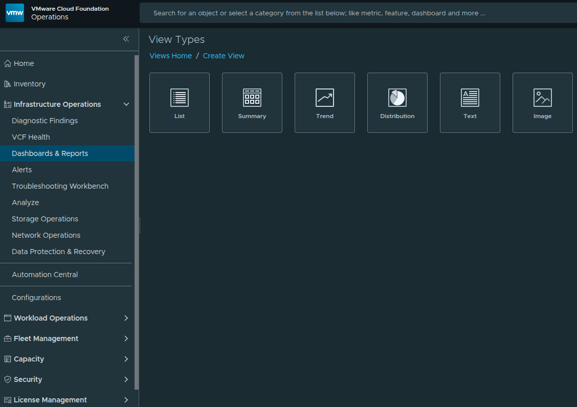
Selecting List as the view type for structured cost reporting.
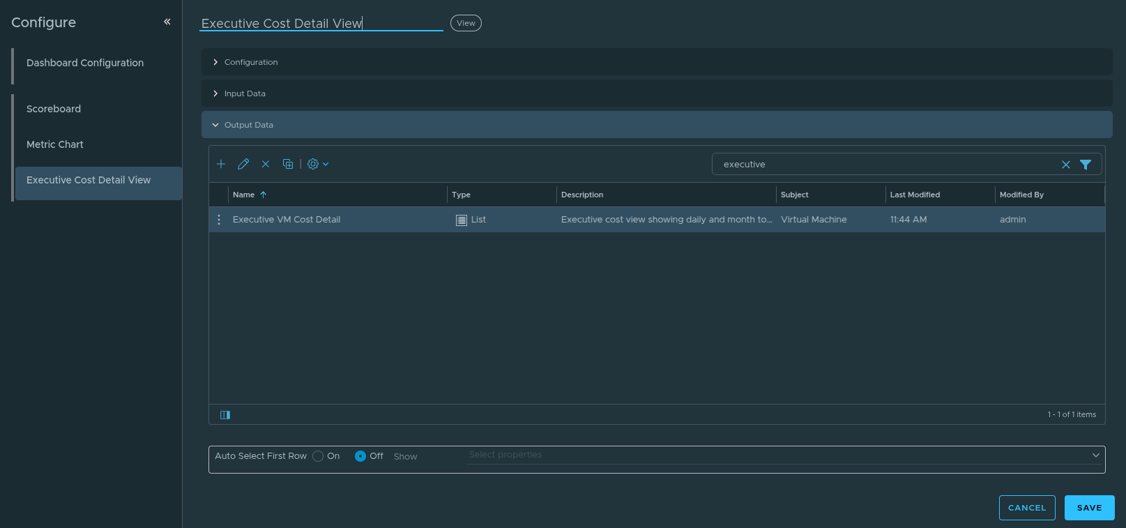
Step 3 — Configure the View Name #
Within the Name & Configuration screen, provide a descriptive name for the view.
Name: Executive VM Cost Detail
Optionally add a description explaining the purpose of the view.
This name will appear when selecting the view in dashboards, reports, and list widgets.
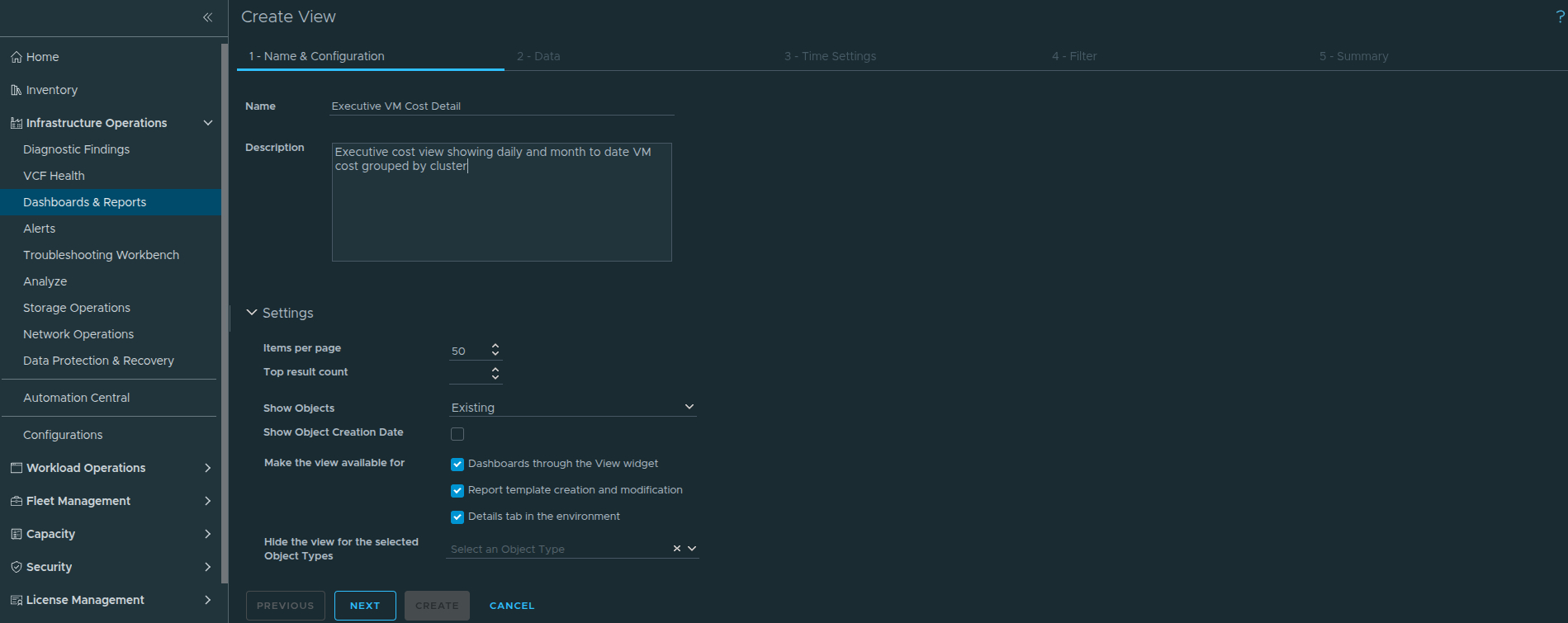
Defining the view name during the view creation process.
Step 4 — Configure the Data Tab #
Click Next to move to the Data tab.
Under Add Subject, select:
Virtual Machine
The Subject defines which object type the metrics apply to. Because cost modeling is calculated at the VM level, selecting Virtual Machine ensures that financial metrics aggregate correctly and support VM-level drilldown.
Next, open the Metrics selector and add the following cost metrics:
• MTD Total Cost
• Monthly Projected Total Cost
• Effective Daily Total Cost
Then add supporting resource usage metrics:
• Effective Daily CPU Usage
• Effective Daily Memory Usage
• Effective Daily Storage Usage
The cost metrics provide financial visibility while the usage metrics add operational context.
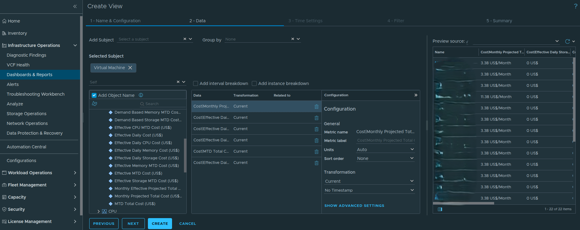
Selecting cost and usage metrics from the metric picker.
Step 5 — Configure Metric Transformations #
Each metric must be configured intentionally to ensure the view produces accurate financial reporting.
For the cost metrics:
MTD Total Cost
Monthly Projected Total Cost
Effective Daily Total Cost
Configure the following settings:
Units
Use adapter-defined currency formatting.
Sort Order
Descending
This ensures the highest cost virtual machines appear first.
First Transformation
Last
Second Transformation
Absolute Timestamp
These transformations ensure the most recent calculated value is displayed while preserving the correct reporting timestamp.
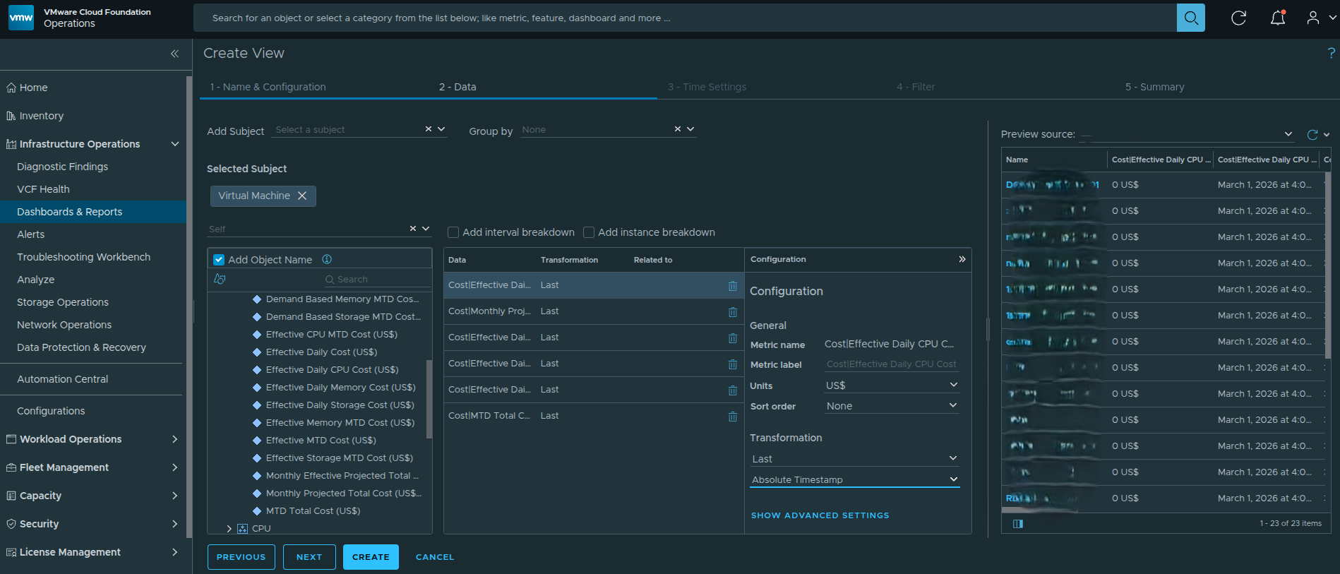
Example metric configuration showing units, sorting, and transformation logic applied to a cost metric.
Step 6 — Configure Usage Metrics #
For the usage metrics:
Effective Daily CPU Usage
Effective Daily Memory Usage
Effective Daily Storage Usage
Apply the following settings:
Units
Auto
Sort Order
None
These metrics provide context and should not override cost-based ranking.
First Transformation
Last
Second Transformation
Absolute Timestamp
Step 7 — Arrange Metric Order #
Reorder the metrics in the Data panel so financial visibility is prioritized:
MTD Total Cost
Monthly Projected Total Cost
Effective Daily Total Cost
Effective Daily CPU Usage
Effective Daily Memory Usage
Effective Daily Storage Usage
This ordering ensures financial metrics remain the primary focus while resource metrics provide supporting context.
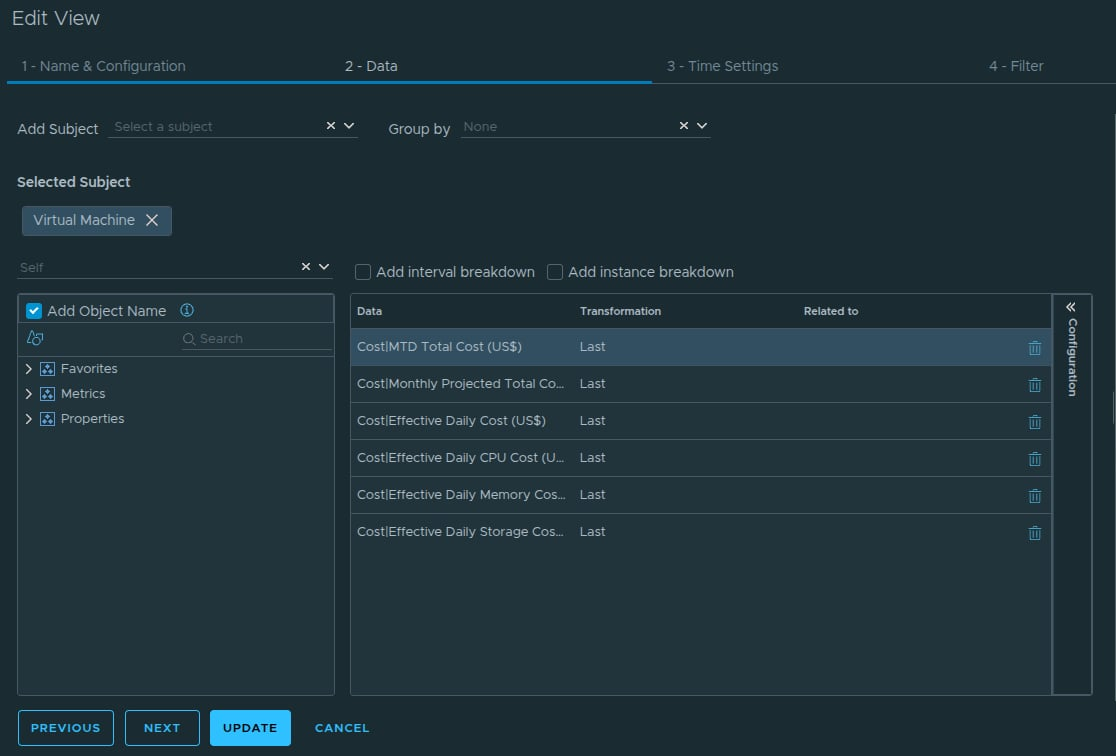
Finalized metric configuration within the Data panel.
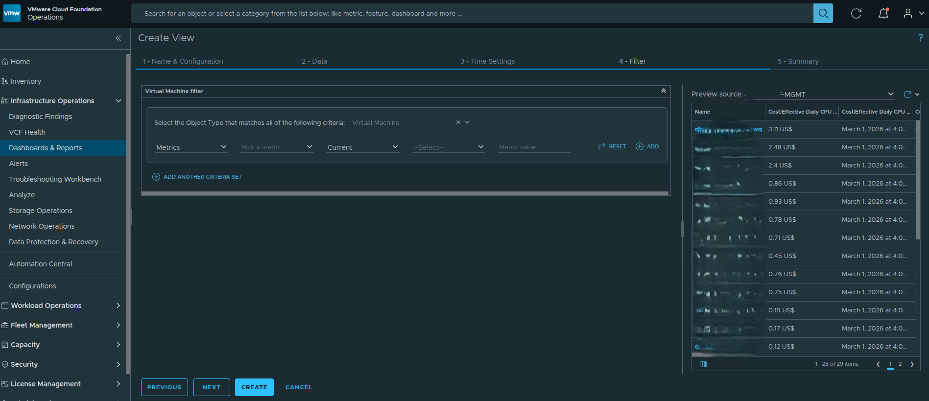
Step 8 — Leave Time Settings and Filter as Default #
After completing the metric configuration in the Data tab, click Next to proceed through the remaining configuration screens.
The next two sections in the view configuration wizard are:
Time Settings
Filter
For this implementation, both of these sections can be left at their default configuration.
Time Settings determines how data is evaluated across time windows. Because the metrics already use the Last transformation with Absolute Timestamp, the default settings correctly display the most recent calculated value.
The Filter section allows administrators to restrict which objects appear in the view. Since this view is intended to support dashboards and reporting across the environment, leaving the filter unset ensures the view evaluates all virtual machines within the selected scope.
Click Next through both sections to proceed to the Summary tab.
Step 9 — Configure the Summary Tab #
After completing the Data configuration, navigate to the Summary tab.
Click Add Summary to create an aggregated row at the bottom of the list view.
Set the aggregation type to:
Sum
This configuration instructs VCF Operations to calculate the cumulative total for each financial metric displayed in the view.
Because the cost metrics represent monetary values, using Sum provides leadership with an immediate understanding of the total cost footprint across all virtual machines in scope.
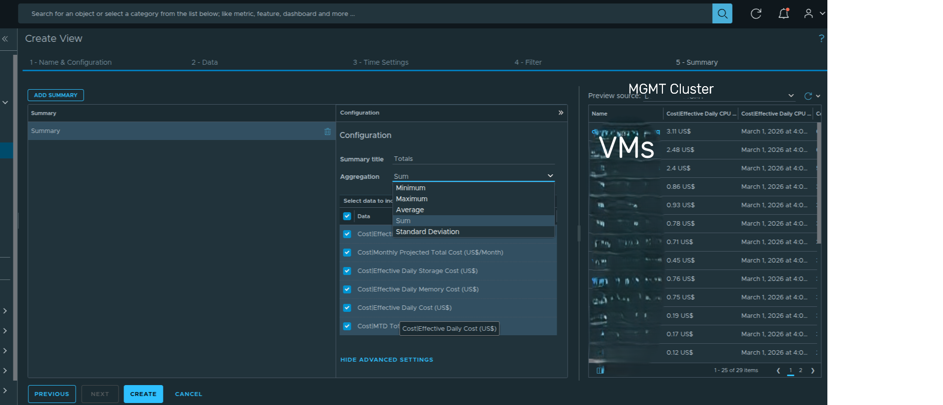
Configuring the Summary tab to generate aggregated totals across all VM cost metrics.
The summary row becomes especially valuable when the view is embedded inside dashboards or exported into reports.
Step 10 — Configure Preview Source #
Before saving the view, validate the data output using the Preview Source feature.
On the right side of the page, locate the dropdown next to Preview Source and click:
Select Preview Source
Selecting the Preview Source dropdown to choose an object for validating the view output.
Next, select an object that contains virtual machines such as a cluster or VCF instance.
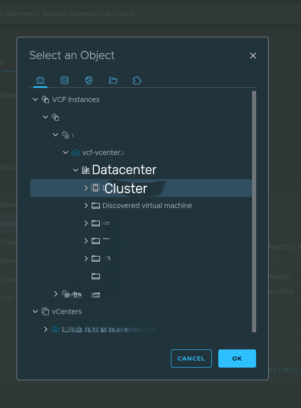
Selecting a preview object to validate the VM-level cost metrics.
Once selected, the preview pane populates with live data and confirms that:
• Cost metrics populate correctly
• Sorting is applied correctly
• Transformations display the latest calculated values
• The summary aggregation appears at the bottom of the view
Previewing the data ensures the view behaves correctly before saving and embedding it into dashboards.
Result #
At this stage, you have created a reusable cost-focused List View that:
• Surfaces VM-level financial metrics
• Applies consistent transformation logic
• Sorts by highest spend first
• Includes an aggregated summary row
• Provides contextual resource usage metrics
When a preview object is selected, the view displays VM-level cost data along with the aggregated totals at the bottom of the table.
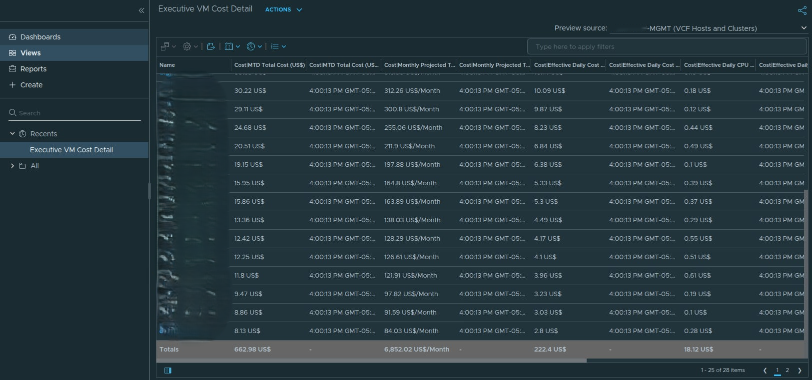
Example output of the Executive VM Cost Detail view after selecting a preview object.
This view now serves as the data foundation for building an executive cost dashboard in VCF Operations.
Building the Executive Cost Dashboard — Scoreboard Layer #
With the reusable cost view complete, the next step is to design the executive dashboard. The first component we will configure is the Scoreboard widget, which provides a high level financial snapshot across domains.
The purpose of this layer is to answer two executive questions immediately:
• How much are we spending this month?
• What is our daily burn rate?
Rather than presenting raw metrics, we structure the scoreboard to compare management and workload domains side by side.
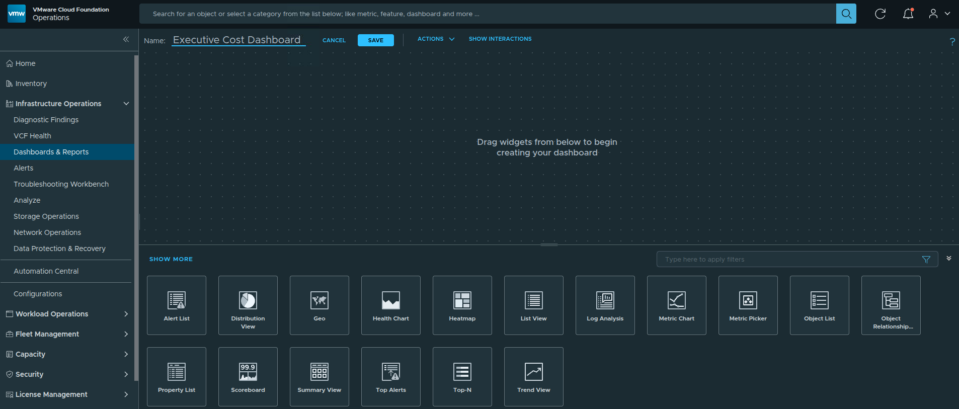
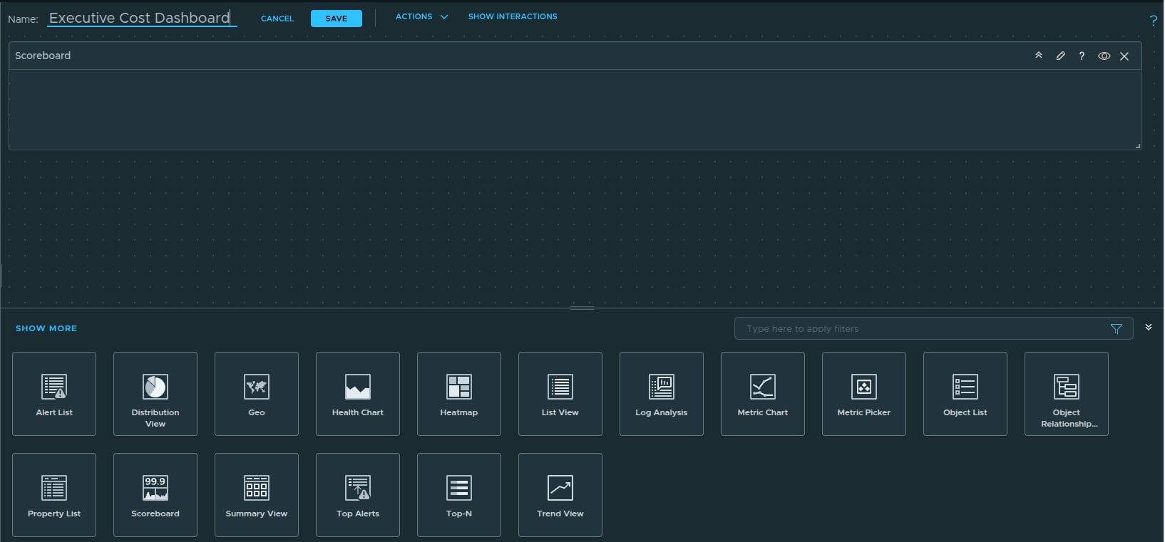
Step 1 — Create a New Dashboard #
Navigate to:
Infrastructure Operations
→ Dashboards
→ Create
Assign a meaningful name such as:
Executive Cost Dashboard
This dashboard will aggregate cost visibility across selected clusters.
Creating a new dashboard for executive cost visibility.
Step 2 — Open the Dashboard Canvas #
After creating the dashboard, the blank dashboard canvas will appear.
This is where widgets will be added to build the executive cost view.
Blank dashboard canvas ready for widget configuration.
Step 3 — Add the Scoreboard Widget #
From the widget library, drag the Scoreboard widget onto the canvas.
Position it at the top and expand it to full width. This establishes the financial summary layer of the dashboard.
Adding the Scoreboard widget to the dashboard.
Step 4 — Enable Self Provider and Display Object Name #
Click the pencil icon on the Scoreboard widget to open the widget configuration panel.
Within the configuration panel, locate the Self Provider option and set it to:
Self Provider → On
Enabling Self Provider allows the widget to directly query objects and metrics from the environment. Once enabled, the Input Data tab becomes available and can be used to add the cost metrics that will populate the scoreboard.
Next, locate the Show dropdown on the right side of the configuration panel.
Select:
Show → Object Name
This adds the Object Name column alongside the default selections such as Metric Name and Metric Unit.
Displaying the Object Name provides important context so viewers can immediately see which domain or cluster the cost values belong to. This ensures the scoreboard clearly distinguishes between the Management Domain and the Workload Domain when presenting cost totals.
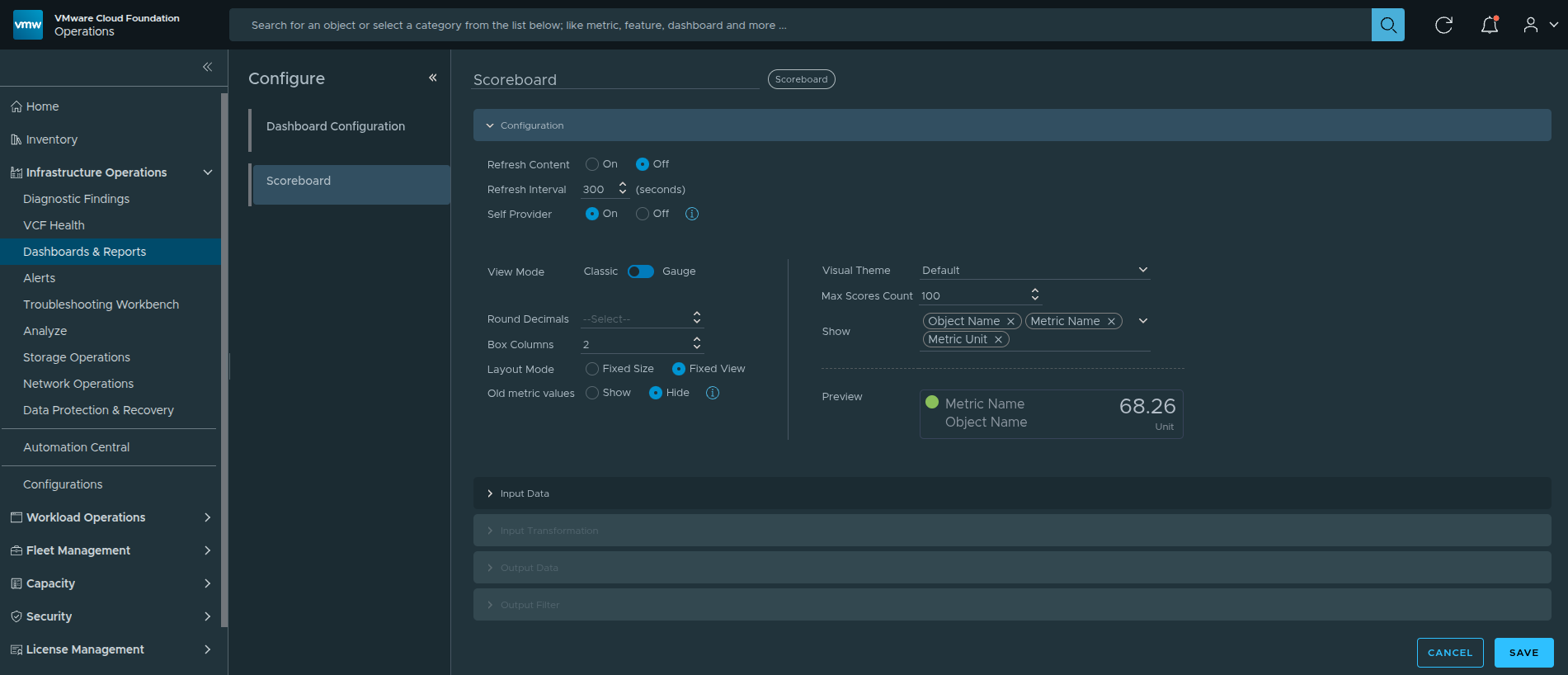
Opening the widget configuration panel, enabling Self Provider, and configuring the Show field to include Object Name.
Step 5 — Add Cluster Cost Metrics #
Under Input Data, select:
Metrics → Add
This opens the Add New Metrics dialog.
In the filter field at the top of the object list, type:
cluster compute
Filtering by cluster compute quickly narrows the object list to the clusters in the environment so they can be selected for cost reporting.
Next, select the cluster objects representing the infrastructure domains and expand the Cost metric category.
Choose the following metrics:
• Monthly Cluster Total Cost
• Aggregated Daily Total Cost
Repeat this process for both the Management Domain cluster and the Workload Domain cluster.
These metrics provide the two financial indicators displayed on the scoreboard:
• Monthly infrastructure spend
• Daily burn rate
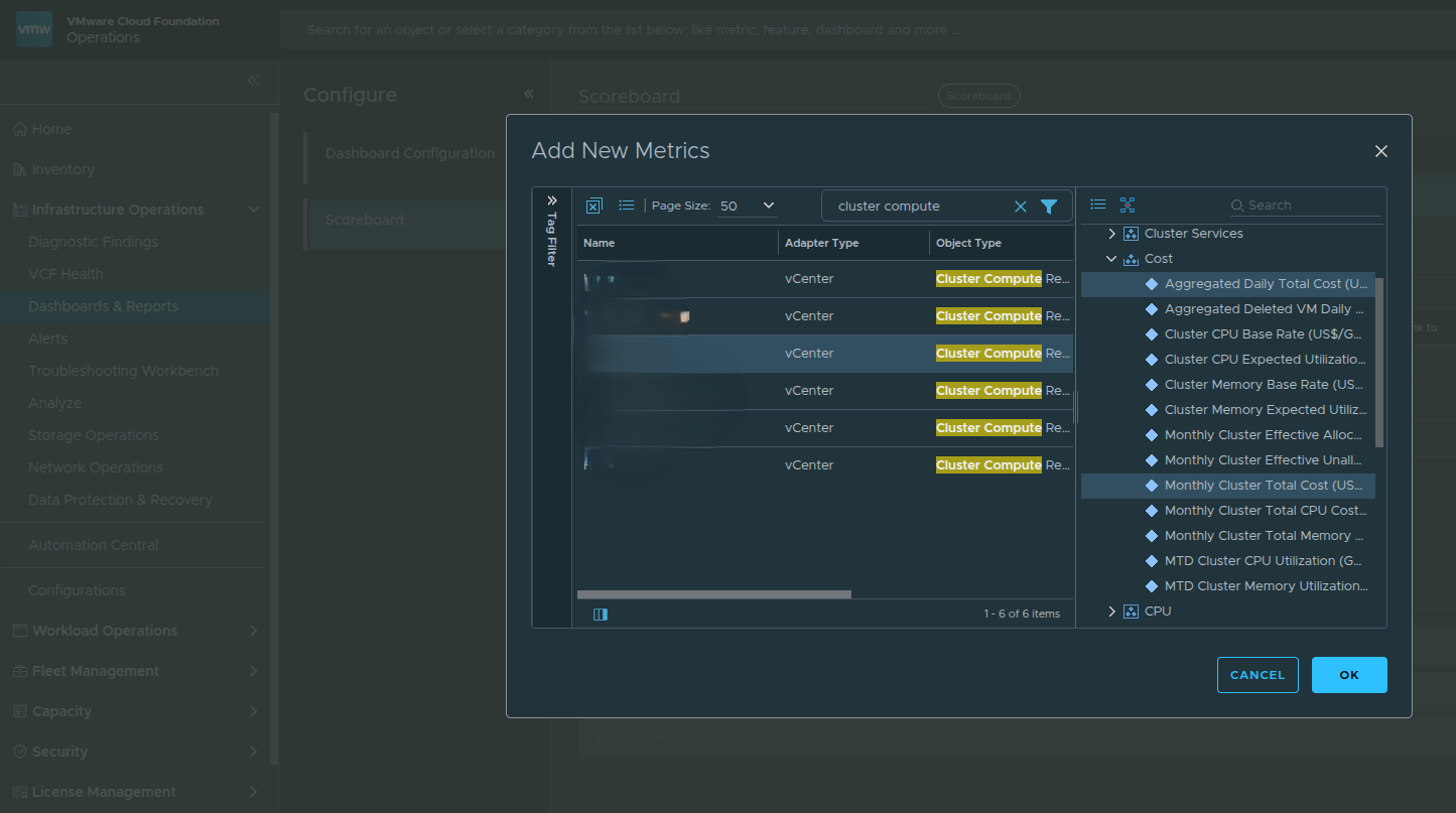
Filtering for cluster compute objects and selecting cost metrics for the scoreboard.
Step 6 — Rename Box Labels for Executive Clarity #
Technical metric names can be difficult for leadership to interpret.
Rename the tiles to:
• Mgmt – Monthly Spend
• Mgmt – Daily Burn
• Workload – Monthly Spend
• Workload – Daily Burn
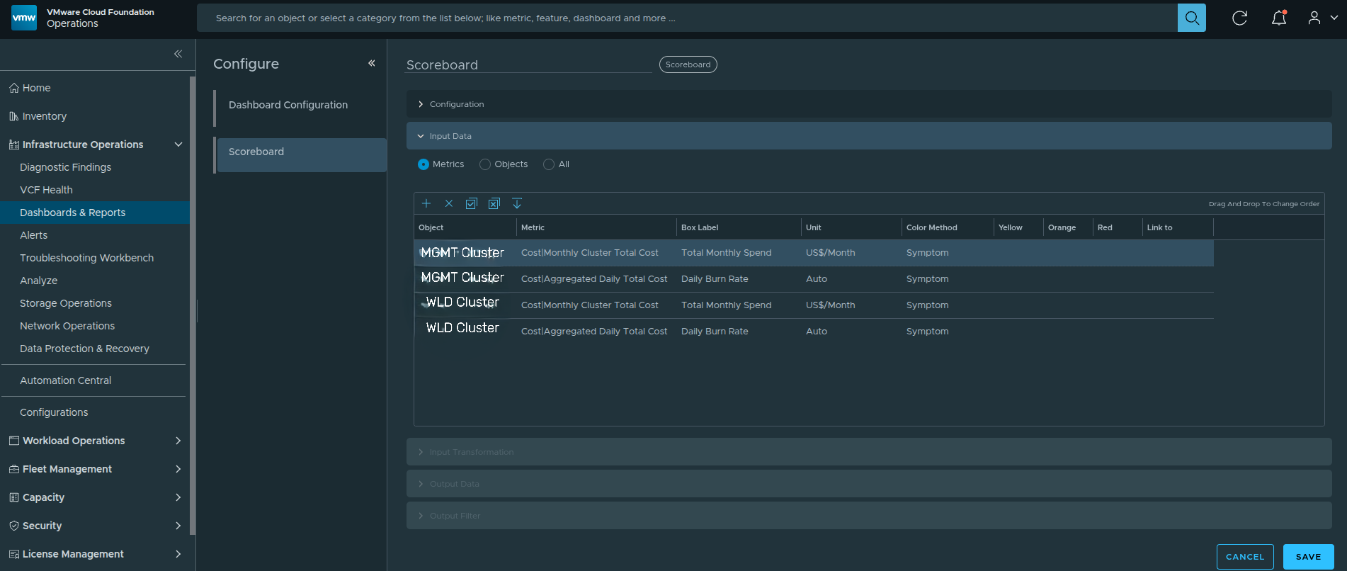
Renaming scoreboard labels for executive clarity.
Step 7 — Validate Scoreboard Layout #
At this stage, the Scoreboard widget should display four financial tiles representing the two primary infrastructure domains.
The tiles should include:
• Total Monthly Spend – MGMT
• Daily Burn Rate – MGMT
• Total Monthly Spend – WLD1
• Daily Burn Rate – WLD1
Each tile represents a domain-level financial metric derived from the cluster cost calculations.
Verify that the values are displayed with the correct units:
• Monthly metrics display as US$/Month
• Daily metrics display as US$
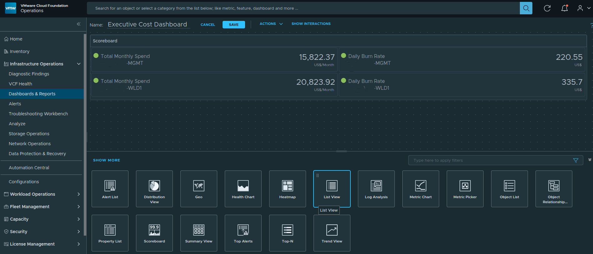
Finalized scoreboard layout showing monthly spend and daily burn comparison between the management and workload domains.
The next step is to add trend intelligence to determine whether cost is stabilizing, increasing, or accelerating.
Adding Cost Trend Intelligence #
The Scoreboard provides a financial snapshot. However, static numbers alone do not tell the full story. Leadership needs to understand whether cost is stabilizing, increasing, or accelerating over time.
To introduce directional awareness, we add a Metric Chart widget to visualize monthly cost trends across domains.
This layer transforms cost reporting into financial intelligence.
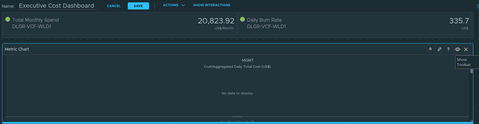
Step 1 — Add the Metric Chart Widget #
From the widget library, drag the Metric Chart widget onto the dashboard canvas.
Position it directly below the Scoreboard and stretch it full width.
At this stage, the chart will appear blank because no input data has been configured yet.
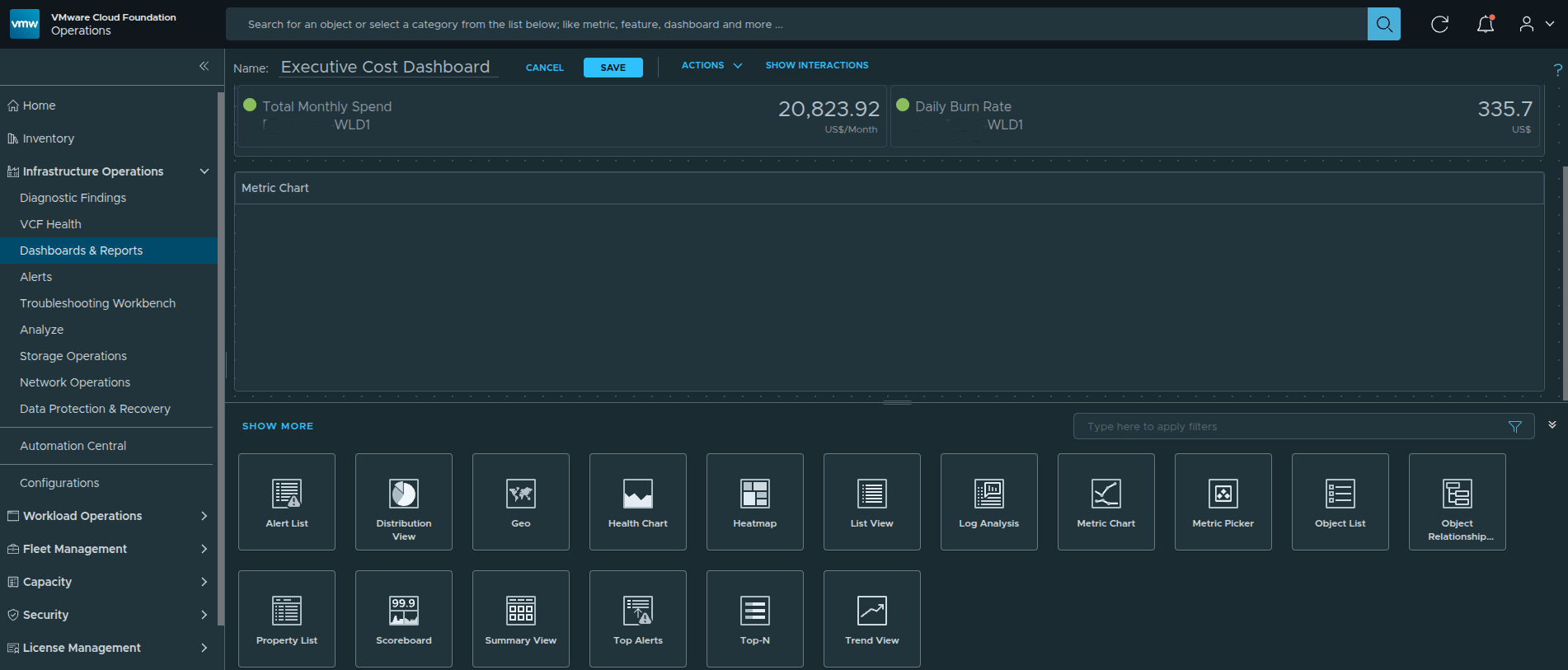
Metric Chart widget added to the dashboard before configuration.
This blank state is expected.
Step 2 — Enter Edit Mode and Select Self Provider #
Click the pencil icon on the Metric Chart widget to enter edit mode.
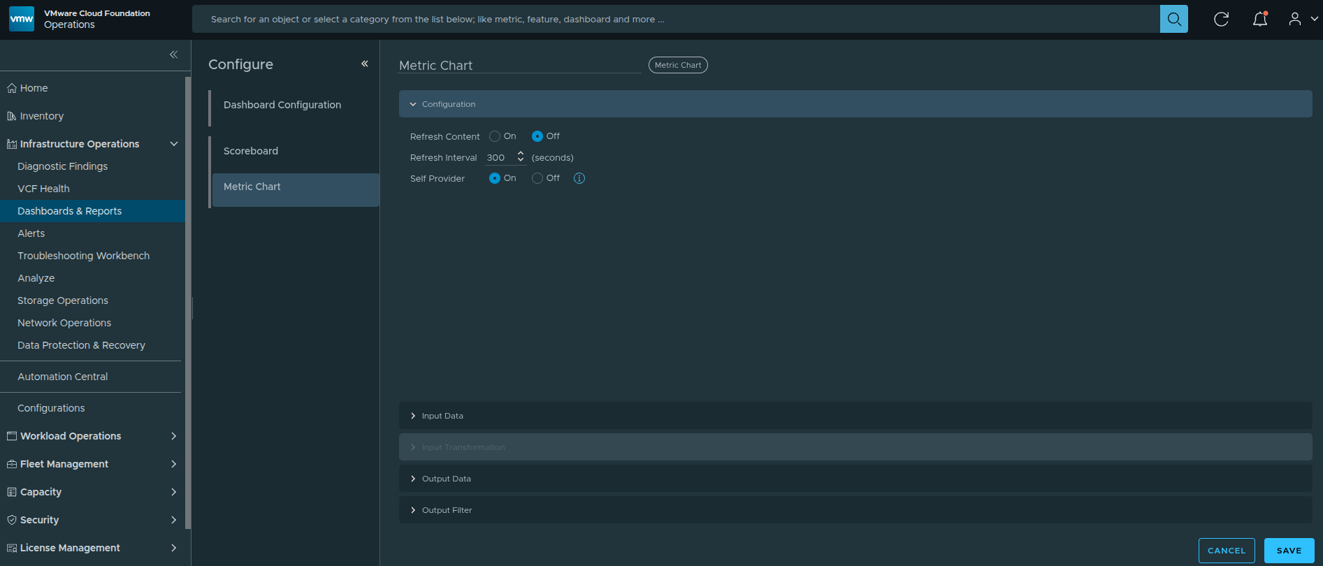
Opening the Metric Chart configuration panel via the pencil icon.
Within the configuration panel:
Locate the Self Provider option and select:
Self Provider → On
When Self Provider is Off, the widget expects data from another source. Setting it to On allows the chart to directly query cluster-level metrics.
Step 3 — Add Cluster-Level Cost Metrics #
Under Input Data:
-
Select Metrics
-
Click the + icon
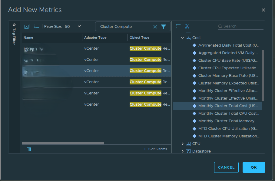
Adding new metrics.
In the metric picker:
In the filter field, type “cluster compute”
Select the Management Domain cluster
Expand the Cost category
Choose:
- Monthly Cluster Total Cost
Repeat for the Workload Domain cluster.
This adds two domain-level cost lines to the chart.
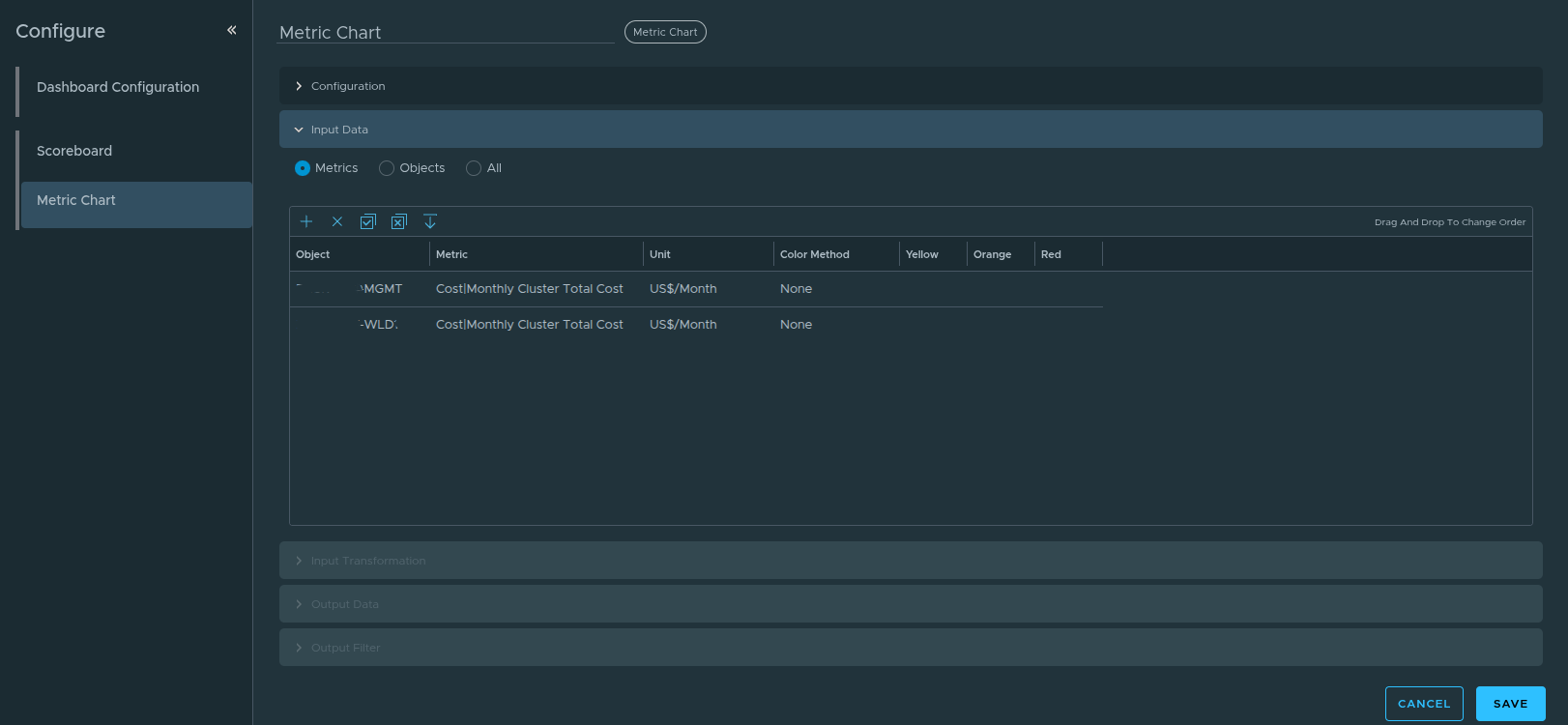
Input Data configuration.
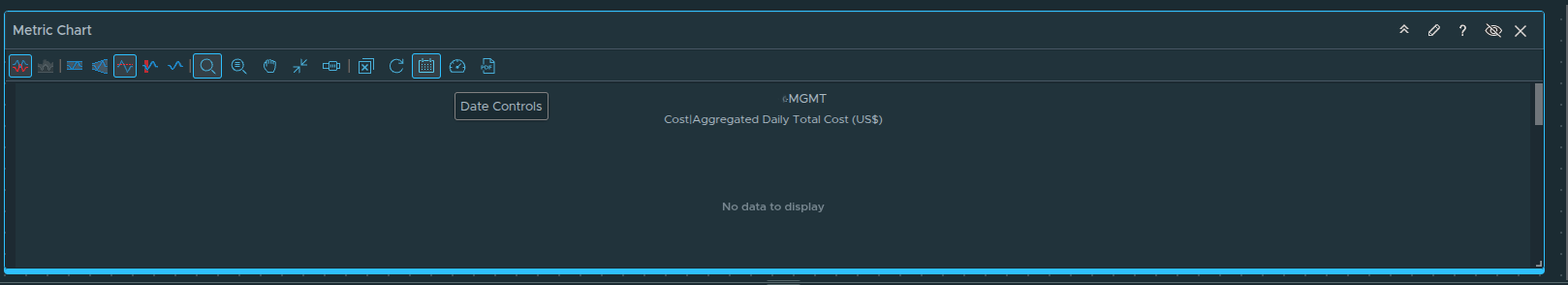
Step 4 — Show the Toolbar to Access Chart Controls #
After selecting metrics, you may notice the chart still does not display as expected. By default, certain chart controls are hidden.
Click Show Toolbar within the chart widget.
Enabling the chart toolbar to access time and comparison controls.
Enabling the toolbar reveals advanced options such as:
-
Date controls
-
Comparison settings
-
Split chart configuration
Step 5 — Configure the Time Range #
Click the date selector within the toolbar.
Set the time range to:
Last 6 Months
If a Previous Period comparison is automatically enabled, you can remove it by clicking the “X” next to it. For executive reporting, side-by-side domain comparison is typically more valuable than previous-period overlays.
Configuring the chart to display the last six months of cost data.
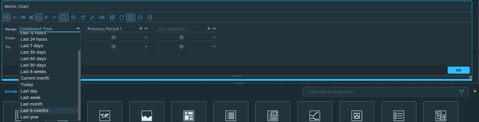
Using a six-month window provides sufficient historical context to identify cost acceleration trends.
Step 6 — Configure Split Chart or Combined View #
Within the toolbar options, you will see the Split Charts setting.
You have two design options:
Option 1 — Combined Chart
Both management and workload domains appear on the same chart.
This allows direct visual comparison between domains.
Option 2 — Split Charts
Each domain appears in its own chart panel.
This reduces visual overlap and isolates trend behavior per domain.
For executive comparison, keeping both lines on the same chart is often preferable. However, split charts can be useful in environments with large cost disparity between domains.
Final Result — Cost Trend Intelligence Layer
With all configuration complete, the chart now displays six months of financial movement across both domains.
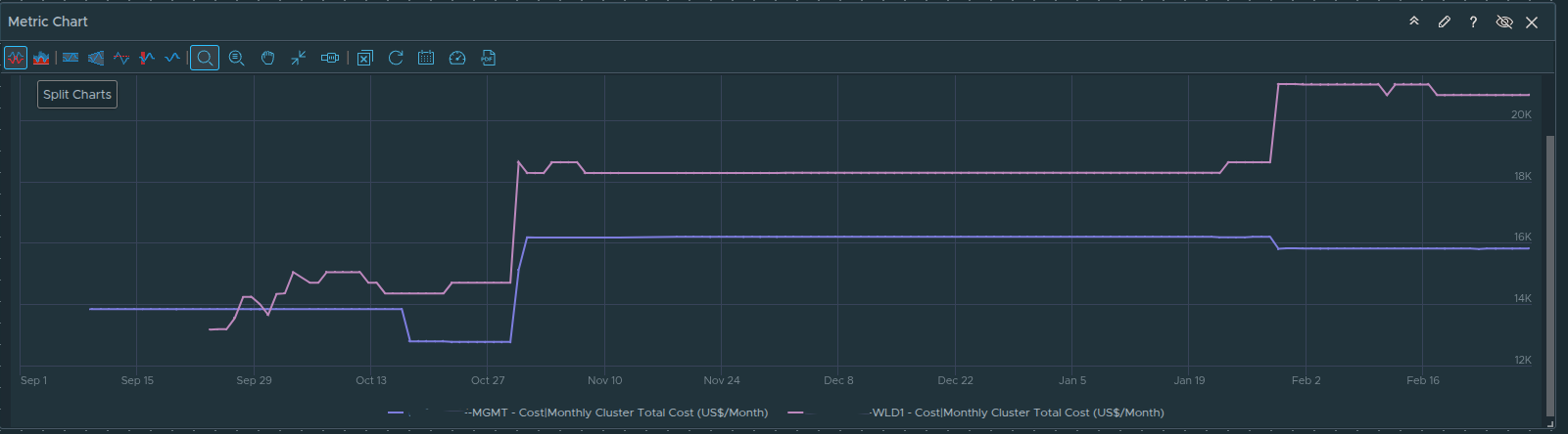
Finalized cost trend visualization showing management and workload domain comparison.
Outcome
The Metric Chart now provides:
-
Historical cost visibility
-
Domain-level spend comparison
-
Acceleration or stabilization awareness
-
Executive-friendly visualization
At this stage, your dashboard answers:
How much are we spending?
How fast are we spending it?
Is cost trending upward or stabilizing?
The final layer will incorporate detailed VM-level breakdown using the custom view created earlier.
Adding Detailed Cost Breakdown with the Custom View #
The Scoreboard provides a financial snapshot.
The Trend Chart provides directional intelligence.
The final layer delivers operational depth.
To allow leadership and engineering teams to drill into VM-level cost drivers, we now embed the custom cost view created earlier directly into the dashboard using a List View widget.
This connects executive visibility with detailed transparency.
Step 1 — Add the List View Widget #
From the widget library, drag the List View widget onto the dashboard canvas.
Position it beneath the Metric Chart and expand it to full width. This creates a natural flow from summary to trend to detail.
Adding the List View widget to the dashboard canvas.
Step 2 — Enter Edit Mode and Enable Self Provider #
Click the pencil icon on the List View widget to open the configuration panel.
Within the configuration panel:
Locate Self Provider and select:
Self Provider → On
This allows the widget to directly query object and view data without relying on another widget for input.
Enabling Self Provider for the List View widget.
Step 3 — Configure Input Data (Select the VCF Instance) #
Under Input Data:
- Click the + icon
Adding input data to define the object scope.
This opens the object selection dialog.
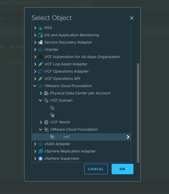
Selecting the VCF Instance as the object source.
Instead of selecting an individual cluster, select the VCF Instance.
By choosing the VCF Instance:
-
Both the Management Domain and Workload Domain are included
-
All VMs across domains are evaluated
-
The view aggregates cost across the full environment
The Input Data defines which objects will be evaluated by the view. Selecting the VCF Instance ensures the dashboard provides complete financial visibility rather than a domain-specific subset.
Step 4 — Configure Output Data (Select the Custom View) #
Next, navigate to the Output Data section.
Click the + icon.
Selecting the custom Executive VM Cost Detail view under Output Data.
In the filter field, type:
Executive
Select:
Executive VM Cost Detail
This binds the List View widget to the custom cost view created earlier.
It is important to understand the separation:
Input Data → Defines the objects (VCF Instance)
Output Data → Defines how those objects are displayed (Custom Cost View)
This design allows the same view to be reused across different scopes if needed.
Step 5 — Save and Validate #
Click Save to apply the configuration.
The List View now renders VM-level cost details across both domains, including:
-
MTD Total Cost
-
Monthly Projected Total Cost
-
Effective Daily Total Cost
-
Effective Daily CPU Usage
-
Effective Daily Memory Usage
-
Effective Daily Storage Usage
-
Aggregated summary totals
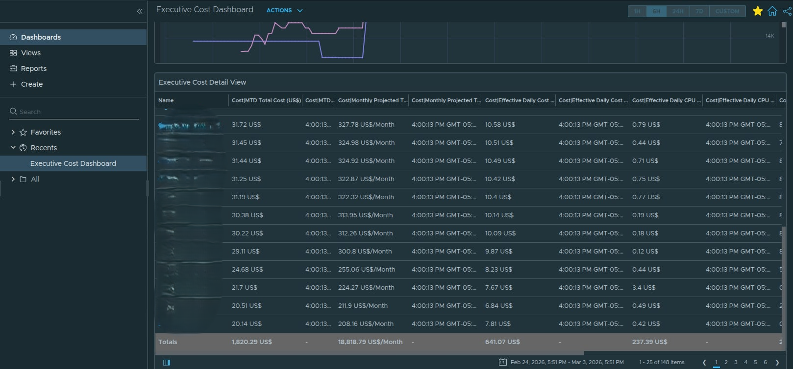
Finalized List View displaying VM-level cost breakdown across the VCF instance.
Result — Executive Cost Dashboard (Complete)
At this stage, the dashboard contains three structured layers:
Scoreboard
High-level monthly spend and daily burn
Trend Chart
Six-month domain comparison and cost movement
List View
Full VCF VM-level financial breakdown with summary totals
This layered architecture ensures:
-
Leadership sees immediate financial impact
-
Trend behavior is visible over time
-
Engineers can identify high-cost workloads
-
Aggregated totals are clearly displayed
-
Governance discussions are data-backed
The dashboard now moves beyond monitoring and into financial operational governance.
Creating and Running the Executive Cost Report #
The dashboard provides real-time visibility, but executive stakeholders often require a formal report for:
-
Budget reviews
-
Governance meetings
-
Monthly financial reporting
-
Program updates
VCF Operations allows you to create a reusable report template using dashboards and views, then generate exportable artifacts in PDF or Excel format.
This section walks through that full lifecycle.
Step 1 — Navigate to Reports #
From the VCF Operations interface:
Infrastructure Operations
→ Dashboards and Reports
→ Reports
Click:
Create
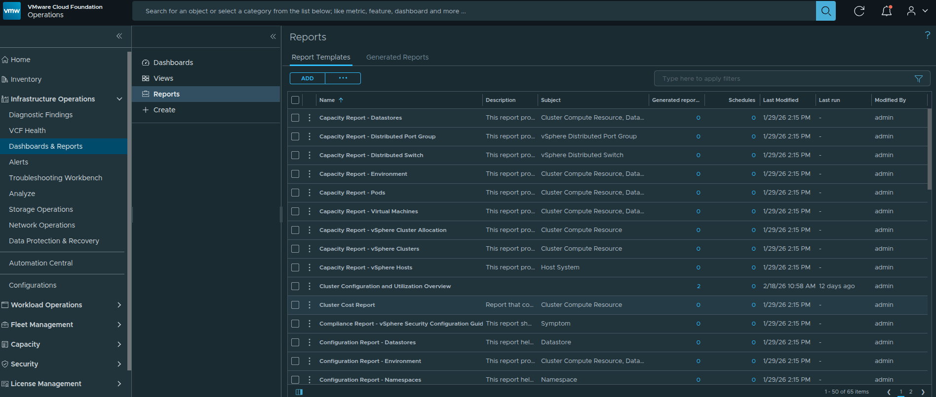
Navigating to the Reports section in VCF Operations.
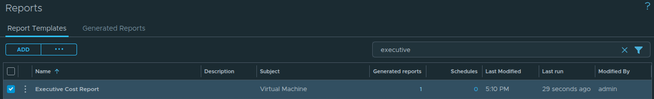
Step 2 — Create the Report Template #
Provide a meaningful name such as:
Executive Cost Report
In the Report Content section, you can toggle between:
-
Dashboards
-
Views
This allows you to include both visual dashboards and structured list views in the same report.
Step 3 — Add the Executive Dashboard #
Toggle to:
Dashboards
In the search filter field, type:
Executive
This quickly locates the custom dashboard created earlier.
Drag the Executive Cost Dashboard into the report layout pane.
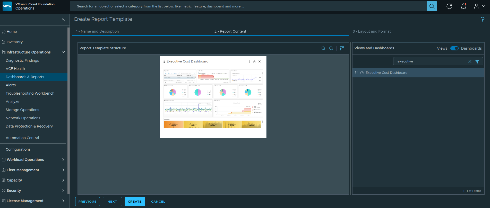
Searching for and dragging the Executive Cost Dashboard into the report layout.
This ensures the report includes:
-
Scoreboard summary
-
Six-month cost trend visualization
-
Embedded VM-level list breakdown
Step 4 — Add the Custom Cost View #
Next, toggle to:
Views
In the search filter field, type:
Executive
Locate:
Executive VM Cost Detail
Drag this view into the report layout pane.
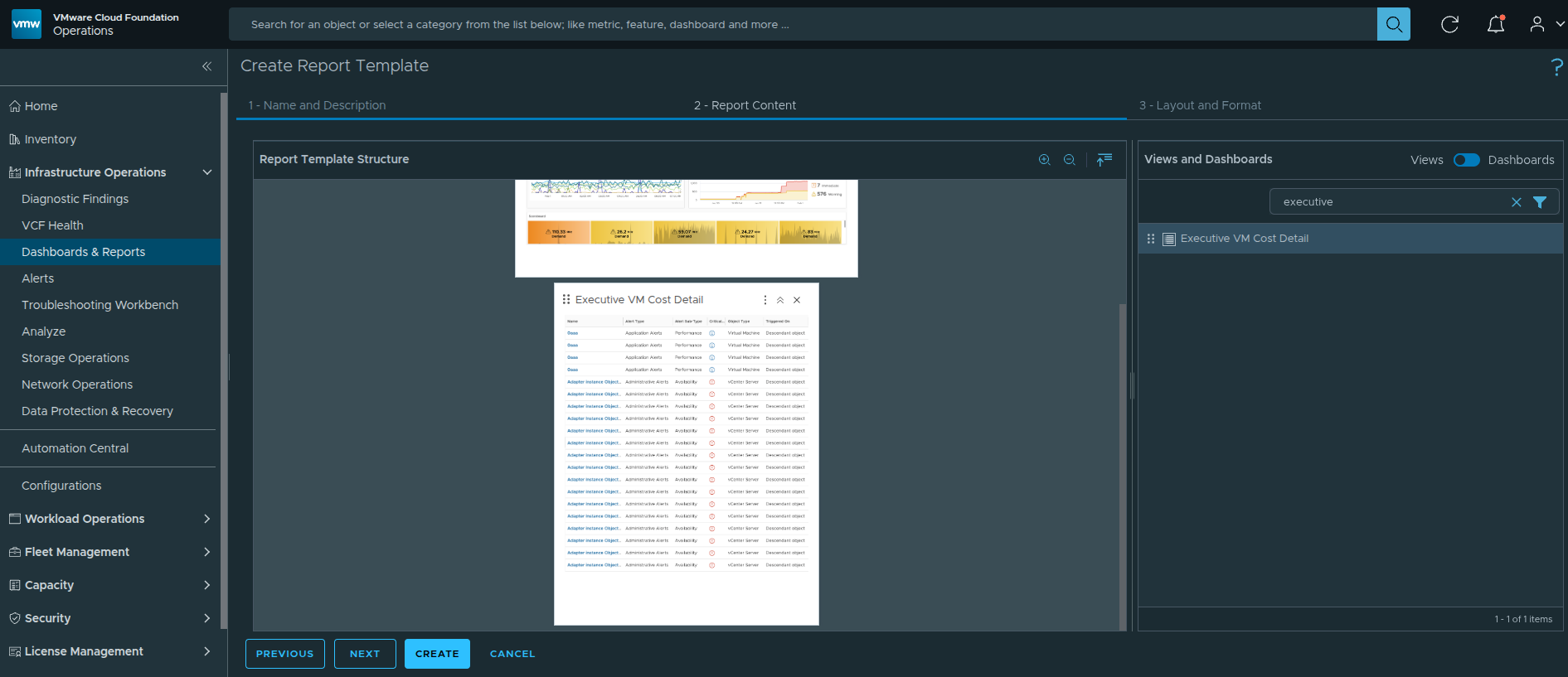
Dragging the custom Executive VM Cost Detail view into the report layout.
Including the view separately ensures:
-
A clean tabular cost breakdown
-
Aggregated summary totals
-
A structured printable format
Your report layout now contains:
Executive Dashboard
Executive VM Cost Detail View
Click Save to finalize the report template.
Running the Report
With the report template created, the next step is to generate an actual report instance.
Step 5 — Run the Report Template #
Locate the newly created Executive Cost Report.
Click the three-dot menu (ellipsis) next to the report template.
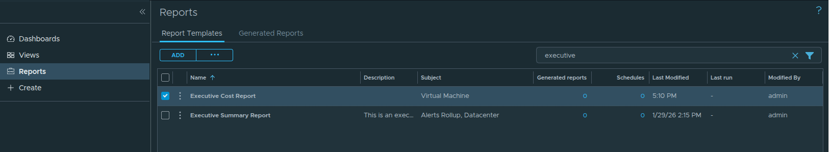
Newly created Executive Cost Report template.
From the menu, select:
Run
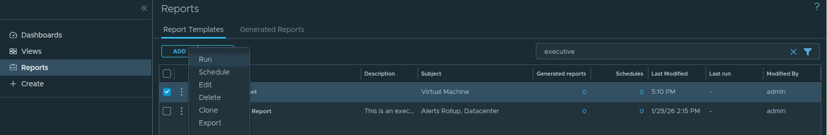
Selecting Run from the report template options.
Step 6 — Select the Object Scope #
After clicking Run, an object selection dialog appears.
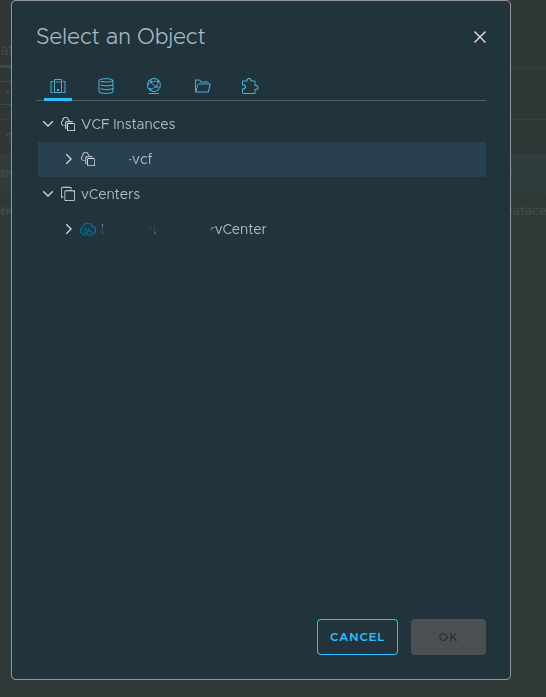
Selecting the VCF Instance as the object scope.
Select:
VCF Instance
Choosing the VCF Instance ensures the report includes:
-
Management Domain clusters
-
Workload Domain clusters
-
All VMs across domains
-
Aggregated financial totals
Click OK to begin report generation.
Step 7 — Access Generated Reports #
After running the report, you will see a numeric hyperlink under Generated Reports.
Generated Reports counter indicating a new report instance.
Click the numeric hyperlink (for example, “1”).
This takes you to the Generated Reports page.
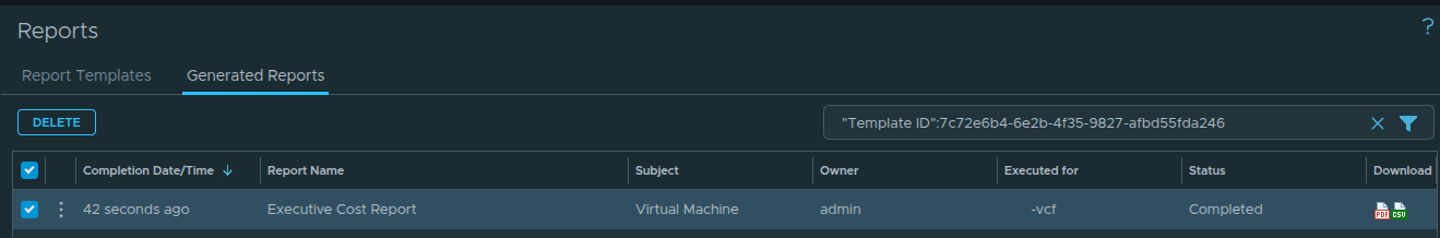
Viewing generated report instances and their status.
Under Status, you should see:
Completed
Once the status is Completed, export options become available.
Step 8 — Export as PDF or Excel #
On the Generated Reports page, you will see export icons for:
-
PDF
-
Excel
Click the PDF icon to download the executive-ready report.
The Excel option can be used for deeper financial analysis or reconciliation.
Final Output — Executive Cost Report
When opening the generated PDF, it will contain:
-
Executive summary scoreboard
-
Six-month trend analysis
-
Detailed VM-level cost breakdown
-
Aggregated totals
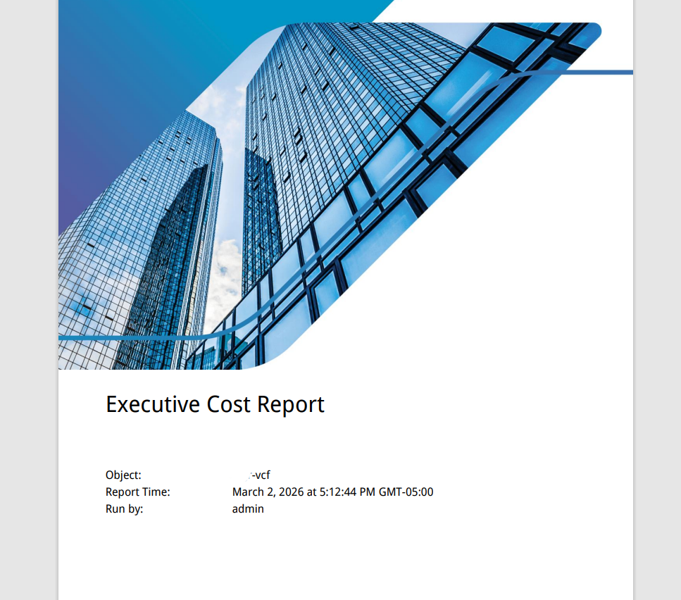
Executive Cost Report rendered in PDF format.
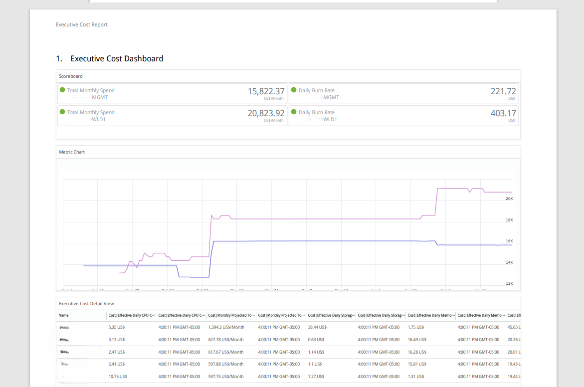
Detailed cost breakdown section within the exported report.
End Result
You have now built a complete cost governance workflow inside VCF Operations:
-
Custom cost-focused List View
-
Layered executive dashboard
-
Reusable report template
-
Exportable PDF and Excel artifacts
This design supports:
-
Real-time operational visibility
-
Executive financial reporting
-
Cross-domain cost comparison
-
Program-level accountability
All screenshots in this article were sanitized to remove environment-specific identifiers while preserving the configuration workflow.